Preloader

Technology

AX – Google’s Open Agentic Orchestrator

Declare an agentic task. AX runs it at scale.

AX sandboxes your task, wires up its workspace, fences its network, and helps you run billions of
them per cluster. Either use a single task per agent, or compose as many as your agent needs.


$ cat task.yaml
apiVersion: ax.io/v1alpha1
kind: Workspace
metadata:
  name: golang
spec:
  git:
    - repo: https://github.com/golang/go.git
      branch: "my-fix"
---
apiVersion: ax.io/v1alpha1
kind: Task
metadata:
  name: test
spec:
  workspaces:
    - name: golang
      goal: "Ensure that Go tool chain is available and is built from source"
  debug: true
$ ax apply -f task.yaml
workspace.ax.io/golang created
task.ax.io/test created
$ ax watch task test
Watching task default/test...
[10:42:01] Phase: Pending    Actor: test               WorkerIP:
[10:42:05] Phase: Running    Actor: test               WorkerIP: 10.20.3.67
Task reached terminal phase "Running".
$ ax get tasks
NAME   ATESPACE   PHASE     ACTOR   WORKER-IP    AGE
test   default    Running   test    10.20.3.67   5s
$ ax ssh test -- ls /workspace
go
$ ax ssh test -- cd /workspace/go && go build ./...
$ ax ssh test -- ps -o pid,cmd
  PID CMD
    1 /usr/local/bin/ax-task-runner
   12 go build ./...
$ ax ssh test -- touch notes.txt
$ ax suspend task test
task.ax.io/test suspended
$ ax resume task test
task.ax.io/test resumed
$ ax ssh test -- ls notes.txt
notes.txt
$ ax suspend task test
task.ax.io/test suspended
$ ax delete task test
task.ax.io/test deleted

How it works

Scales up to billions of tasks.

AX runs on top of Agent Substrate,
a compute runtime designed from the ground up for massive density and fast stateful actor lifecycles.

Billions of tasks

Every task runs as a lightweight actor, allowing you to scale to
billions of concurrent agent sessions per cluster without orchestrator limits.

Sub-second resumption

Idle agents waiting on model responses, external tool calls, or human responses are checkpointed, suspended,
and brought back
in under a second with zero cold-start delay.

Dense multiplexing

Dozens of tasks share worker resources, turning idle waiting time into spare compute capacity so you only pay
when agents are actively thinking and running code.

Generative platform

Generative features built into the platform.

AX integrates generative AI directly into the platform. For example, if you want to set up a workspace just by explaining it in plain English, the environment is prepared automatically before your task starts.

task.yaml
apiVersion: ax.io/v1alpha1
kind: Task
metadata:
  name: data-analysis
spec:
  workspaces:
    - name: python-env
      goal: "Set up a Python 3 development environment"

Generative workspaces

Describe what a ready environment looks like in plain English. AX hands that goal to an agent on first boot
to install toolchains and verify dependencies.

Run anything and everything

Interactive coding agents, long-running agent servers, Jupyter notebooks, headless browser testing, and custom tool runtimes—you name it.

Perfect for research

Spin up massive number of reproducible sandboxes to collect trajectories, run reinforcement
learning loops, and evaluate agents at scale.

For builders & researchers

Built to be the most friendly runtime for developers and researchers.

We want to make dealing with agentic infrastructure easier so you can focus on your work. AX
is
designed with an uncompromising focus on ergonomics, rapid iteration, and joyful workflows for both application
developers and AI researchers.

We aim to keep the runtime minimal and lightweight, while tastefully adding the essential
features everyone needs to build, evaluate, and scale agents.

About

Born from research, built for production.

AX was born at Google when agentic runtime systems research met frontier compute. Over years
of building and operating agentic execution engines, teams across Google recognized that agentic workloads
represent an entirely new computing paradigm: stateful, bursty, long-running actors that compute intensely for a
minute and then wait for model responses, tool responses, or human approval. Traditional orchestrators built for
stateless
microservices or predictable batch jobs become cost-prohibitive when keeping idle sandboxes running, yet lack
native support for sub-second suspend and resume.

Drawing on agentic runtime research from Google DeepMind alongside deep experience in
large-scale isolation, resumption, and scheduling, AX is being built as an open, declarative control plane
purpose-built for agent execution. It abstracts tasks, workspaces, network policies, and models into core
primitives so developers and researchers can run massive fleets of agents without reinventing the underlying
infrastructure. This project heavily relies on Agent
Substrate
but provides agentic abstractions and generative runtime components.


Source: Hacker News

A Necessary History of the Oddest Letter: W

“The letter W is a child of the fall of Rome. In the fifth century CE, the western half of the Roman Empire disintegrated into a patchwork of new kingdoms and new rulers. The reasons behind this collapse of imperial power are complex, but a large role was played by various peoples who had formerly lived outside its borders. The Romans might have looked down on these migrants as ‘barbarians’, but they also increasingly came to rely on them for military support. They were foederati—peoples bound by treaty to fight Rome’s enemies in return for land and food. It was only with the help of the foederati (a Latin word related to English federation) that the Romans were able to see off the threat of Attila the Hun in 451. Yet the more power these regional leaders had, the less authority the emperor and the central state could wield. This culminated in the overthrowing of the last emperor in the west in 476.

Language would have been a part of the divide between Roman and barbarian. By the fourth and fifth centuries, the western empire had become overwhelmingly Latin-speaking. By contrast, the newcomers spoke their own languages, perhaps with a passing knowledge of Latin too. From what we can tell, a great many of these migrants spoke Germanic languages. One of these incoming tongues was the ancestor of the language you are reading right now, English, which arrived in the remains of Roman Britain during this era. Germanic-speaking elites could now be found from southern Spain to the coasts of the North Sea. These new rulers were keen to sell themselves as legitimate successors to the emperors, and there was considerable continuity during this turbulent period.

By keeping up appearances and styling themselves as good Romans, they could dampen the jealousy of the old aristocracy and gain popular support. The new kings did not insist that scribes ought to write official documents in their own Germanic tongue, but eagerly adopted the more prestigious Latin language. This worked fine most of the time, but might occasionally hit a snag. Latin-writing lands were now ruled by men whose names contained un-Latin sounds. A new king might want his scribes to draw up a charter for some great display of generosity, but how were the scribes to spell that king’s name?

One of the troublesome sounds for writers was /w/. This is the common consonant in English water and want, and it would have been present in kingly Germanic names like Clovis, Vitiges and Odoacer. The trouble was, the Latin alphabet now had no letter for this sound.

Nonetheless, W established itself as a standard way to spell the Germanic sound /w/, including in Latin texts produced in England.

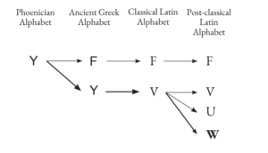
In ancient times, you would’ve heard the sound /w/ all around the Mediterranean Sea. Both Latin and Ancient Greek once used the sound, and both the Romans and the Greeks had letters to spell it. This was a sound that they, just like English, had inherited as part of their common Indo-European ancestry. Yet, as we saw in Chapters F and U, it was now foreign to them. In Greek, the consonant and its letter Ϝ had faded away, while in Latin, V had come to stand for the fricative /v/ instead.91 Time and time again, we find the ancient sound /w/ being lost or altered across the Indo-European family of languages. It would later happen in Continental Germanic languages too; in German today, W stands for /v/. The English consonant /w/ is actually a rare survivor, rescued from potential change by its migration to the island of Britain.

Out of the meeting of languages and writing in the new post-classical world, a letter was born to spell the alien /w/. From the sixth century onwards, likely starting in the powerful kingdom of Francia, innovative scribes doubled U. Within Latin texts, we find Germanically-named individuals like the abbot UUandeberctus and King UUaldemarus. The two letters were increasingly written as -one, and at least by the 11th century, they had fused into the letter W as we know it. Note that this was long before the split of V and U into two separate letters, hence some modern disagreement over their offspring’s name. In the English alphabet, it’s called double U. For the French, it’s double vé.

From its origins in Francia, W was exported to nearby lands that also needed it. W appears in early English texts, although not without competition. One alternative, seen in Cædmon’s Hymn in Chapter U, was a single U. Scribes would switch to one U when the following vowel was an /u/. This would avoid awkward-looking sequences of three Us in a row.

This dislike of ‘triple U’ in medieval texts is in fact still active in English spelling today. In the later Middle Ages, scribes would swap a U for an O if it came after W. This was done for the sake of clarity when reading. Even when words had a short /u/ vowel, spellings like wulf, wud and wunder would have been too confusing in the era of manuscript writing, what with its rows of upright quill strokes. This avoidance tactic can explain the modern mismatch between sounds and spelling in wolf, wood and wonder. Nonetheless, W established itself as a standard way to spell the Germanic sound /w/, including in Latin texts produced in England.

Nonetheless, W established itself as a standard way to spell the Germanic sound /w/, including in Latin texts produced in England.For example, the Life of Saint Æthelwold is a tenth-century biography that narrates the holy life of an English bishop. Being based in southern England, its Latin language is crammed full of English place-names containing the sound /w/, like Winchester, Worcester and Wallingford. The saint’s own name is spelled Aðeluuoldus.

Yet, during the same pre-Norman period, a specifically English written culture was also emerging alongside Latin. Its writers clearly had a sense that this was a separate language from Latin, and therefore could have its own spelling practices. While writing in Latin ought to use only Latin letters, they felt that they had more freedom when spelling Old English. Just as they had done with the letter Þ, English writers looked for an alternative to a lengthy W or an ambiguous single U. They reached into the world of runes, and employed Ƿ.

Instead, W has been brought in to tell the reader that the OW in town is a greatly shifted diphthong, no longer a single long vowel as it had once been.

Known as wynn, the letter Ƿ is extremely common in our Old English sources. See on p.301 how it appears twice in the first line in our only surviving copy of the poem Beowulf, in the words hƿæt ‘what’ and ƿe ‘we’.

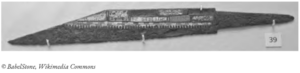
It was standard spelling in the Wessex tradition, which would have written two and word as tƿa and ƿord. Examples of Ƿ outside the parchment pages of manuscripts show that the letter enjoyed popular use for centuries. A decorated dagger, found in Kent and dated to the ninth or tenth century, informs its viewers:

   Biorhtelm me ƿorte                   ‘Biorhtelm wrought me’

  S[i]gebereht me ah                    ‘S[i]gebereht owns me’

Yet, as you might have noticed, wynn is no longer a part of the English alphabet. It did survive the Norman Conquest, but gradually fizzled out during the Middle English era. It faced considerable opposition from the spelling of French and Latin, which had continued to use W since the sixth century. The pressure to match them meant that it was by W that Ƿ was eventually replaced.

Ever since the reapplication of W to English, the language has put the letter to a great many uses. Some instances of W are more recent in origin. Some even developed out of an original G.

In Old English, the letter G stood for one of a couple of similar sounds, depending on where in the word it came. In the middle of a word, a G represented a velar and fricative sound that was like a weaker /g/. During the Middle English period, this sound shifted into /w/, which also has a velar quality as a sound. This is how an Old English word like fugol ‘bird’ has become fowl, or how the sagu tool is now a saw. The Norse concept of lǫg, the facts of life laid down by fate or society, is behind English law.

These changes of G to W reflect a changed consonant, but elsewhere in spelling, W is used to tell us something about a vowel. It is especially common in words that have undergone the Great Vowel Shift, like town, cow and owl. These go back to tun, cu and ule in Old English, none of which had a G. Instead, W has been brought in to tell the reader that the OW in town is a greatly shifted diphthong, no longer a single long vowel as it had once been.

OW shares this role with OU. The second option for the same vowel appears instead in words like hour, shout and found. There has been a half-hearted rule in English spelling to use OW at the end of a word or syllable, and OU everywhere else. This rule would explain why we don’t write ‘nou’, ‘eyebrou’ and ‘allou’, but rather now, eyebrow and allow. At the end of a word like now, there is an audible /w/ sound, especially if the next word begins with a vowel (e.g. now I think …). However, this rule hasn’t been rigorously applied; we ought to write ‘broun’ and ‘croun’, not brown and crown.

Both OU and OW had good reasons to become the standard spelling for this post-shift vowel, but English failed to make a firm decision in favour of one or the other. It has even exploited the optionality to distinguish different words with a common origin. We spell flower with OW, while we use OU for the best quality or the ‘flower’ of ground grain—that is, flour.

Before we can leave W, there’s a mischievous effect of the letter to be acknowledged.

Consider three words: as, has and was. The third word, I think you will agree, does not rhyme with the previous two, despite their common spelling. Likewise, consider: and, hand and wand. The same lack of rhyme occurs, as it does in the trio arm, harm and warm. Notice the odd one out in ash, bash, cash, dash, gash and wash. If we also compare fan with swan, far with war, or fat with what, then their common denominator becomes clear: there’s something disruptive about the letter W.

To understand this effect, we have to concentrate on a particular quality that sounds in our languages can have. Vowels have featured often in this book, especially with regard to how far forwards, backwards, high or low our tongue is when we pronounce them. These features of tongue position are accompanied by the additional factor of lip rounding—whether or not we purse our lips at the same time.

The key thing to note here is that the consonant /w/ is pronounced with the lips and the back of the tongue. In the case of was, wand, wash and the rest, what has happened is that the /w/ rounded the following vowel, and also dragged it backwards in the mouth. The consonant has shared its rounded lips with the formerly unrounded vowel that comes immediately after it.

Consequently, in many varieties of English today, was, wand and ward have rounded vowels, while unrounded vowels can still be heard in their W-less counterparts, has, hand and hard. The cot-caught merger in North American English (see Chapter O) may be shifting and unrounding the particular vowel in the W-words, but nonetheless, hand still doesn’t rhyme with wand. The fact that this is an effect of adjacent sounds explains why the same changes and divergent vowels have also occurred in quality and quartz. They are not spelled with a W, but they still contain the influential consonant. Quartz doesn’t rhyme with parts, but rather shorts.

We still spell wash and warm as if they rhyme with ash and arm, because until fairly recently, they did. Their rounding is quite modern. It may have started sometime in the 15th century, but for the following four centuries, it remained limited to certain words and contexts. The first instances of W-rounding were likely in very common and unstressed words, like was. When said frequently and quickly, it’s more efficient to progress from a rounded-lipped consonant to a rounded vowel, than to switch off that rounding between the two. The effect was probably not present in the English of Chaucer, nor standard in the later speech of Shakespeare, on the basis of the words that these poets think are rhymes. In his sonnets, Shakespeare pairs was with glass, and warmed with disarmed.

Then were not summer’s distillation left,
A liquid prisoner pent in walls of glass,
Beauty’s effect with beauty were bereft,
Nor it, nor no remembrance what it was.

–Shakespeare, Sonnet 5

The fairest votary took up that fire
Which many legions of true hearts had warmed;
And so the general of hot desire
Was, sleeping, by a virgin hand disarmed.

–Shakespeare, Sonnet 154

Even Lord Byron, composing his narrative poem Childe Harold’s Pilgrimage in the early 19th century, rhymes three words that together sound awkward today.

I stood in Venice, on the Bridge of Sighs,
A palace and a prison on each hand:
I saw from out the wave her structures rise
As from the stroke of the enchanter’s wand:
A thousand years their cloudy wings expand …

–Lord Byron, Childe Harold’s Pilgrimage, Canto IV

Yet again, we have an instance of a reasonable change in sounds, and spellings that have not caught up. We could of course start to write wond instead of wand, or wor instead of war, or even woz for was. Maybe we will one day. For the moment at least, English readers and writers know to be cautious around the English letter W.” (297–306)

__________________________________

This article has been adapted from Why Q Needs U (Blink/Bonnier, U.S. June 2, 2026) by Danny Bate. It is provided courtesy of the publisher.


Source: Hacker News

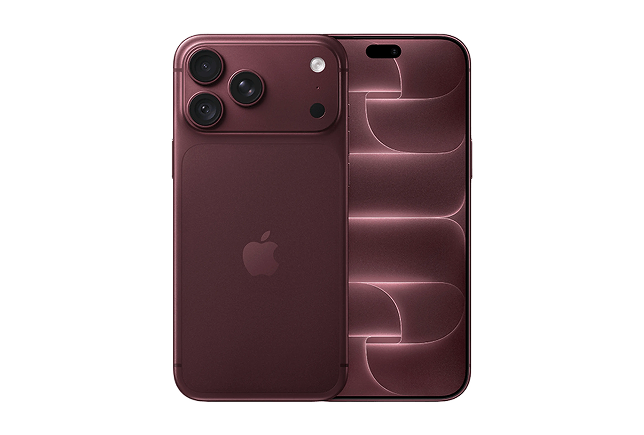
Apple iPhone 18 Pro Camera test

Smartphones
 >  Apple iPhone 18 Pro
 > 
Camera Test Results

The Apple iPhone 18 Pro camera performance is evaluated across photo, zoom, and video use cases using DXOMARK’s objective measurements and perceptual analyses to assess imaging performance across common shooting conditions. This article provides a structured summary of DXOMARK’s lab measurements and perceptual analyses to describe the device’s imaging performance.

Overview

Key camera specifications:

  • Primary: 48 MP, f/1.48 – f/4.0, 24 mm (wide), variable aperture, sensor-shift OIS, Focus Pixels
  • Ultra-wide: 48 MP, f/2.2, 13 mm (ultrawide), 120° field of view
  • Tele: 48 MP, f/2.8, 100 mm (telephoto), 8x optical zoom, tetraprism design, sensor-shift OIS

With a score of 172 points, the Apple iPhone 18 Pro delivers excellent overall camera performance, combining a wide dynamic range, improved contrast and skin tones, effective stabilization, and a well-balanced texture-noise trade-off. Its variable aperture is a particular strength, significantly improving the camera’s ability to maintain sharpness in complex scenes and when multiple subjects are present. Autofocus performance is good overall, offering a good user experience. Flare is also generally better controlled than on the previous generation, with a good reduction of diffuse flare in most situations, although green spots can still appear and flare remains quite visible when the iris is closed.

In photo, the camera produces generally accurate exposure and benefits from a wide dynamic range. Exposure can, however, be slightly low in some backlit portrait scenes, while contrast rendering in these situations remains particularly natural, providing a convincing balance between highlights and shadows. Texture rendering preserves a good level of fine detail with fewer visible AI artifacts than on some competing devices.

Apple iPhone 18 Pro – Well exposed portrait, balances contrast, vivid skin tones and sharp details on face

The main limitations are long-range telephoto performance, which falls slightly behind some competing flagship devices, and the lack of blur effect on portrait mode in night

Video performance is excellent overall, with smooth and natural stabilization even during running motion, as well as a good texture-noise compromise. Outdoor scenes benefit from the camera’s strong dynamic range, while low-light video shows improved color rendering, particularly for skin tones. White balance remains the main image-quality limitation, with visible color casts appearing in some conditions.

Scoring

Sub-scores and attributes included in the calculations of the global score.


Apple iPhone 18 Pro

172
camera
171
Photo
181

184

175

185

152

175

143

173

176
Video
189

Best

152

Best

127

140

Use cases & Conditions

Use case scores indicate the product performance in specific situations. They are not included in the overall score calculations.

BEST 169

Portrait

Portrait photos of either one person or a group of people


Top score Best

Outdoor

Photos & videos shot in bright light conditions (≥1000 lux)

BEST 180

Indoor

Photos & videos shot in good lighting conditions (≥100lux)


Top score Best

Lowlight

Photos & videos shot in low lighting conditions (<100 lux)

BEST 161

Zoom

Photos and videos captured using zoom (more than 1x)

Pros

  • Exposure is mostly accurate, and it is supported by a wide dynamic range, contrast is very natural even under challenging conditions
  • Depth of field is automatically extended on group portraits thanks to variable aperture, which can be adjusted manually
  • Stabilization is effective, even during running motion, with smooth and natural rendering enhanced by 60 fps capture
  • Texture-noise trade-off is well balanced across most test conditions, combining high detail preservation with well-controlled noise

Cons

  • Face exposure can be low in challenging backlit conditions
  • Slight color casts and occasional white balance instabilities are noticeable
  • Long-range telephoto performance is behind that of some flagship competitors
  • Artifacts such as flare and aliasing are frequently visible
  • A noticeable brightness difference between photo and video can be distracting in the preview


Top score Best

Lowlight

The Apple iPhone 18 Pro is one of the strongest-performing devices overall in low-light conditions, thanks to strong performance in both photo and video. Images are generally well exposed, with a wide dynamic range and pleasant color rendering. White balance has also been improved, maintaining the device’s characteristic warm signature while keeping it relatively natural in low-light scenes.

Texture rendering is another major strength at night. The camera preserves a high level of detail while maintaining a well-controlled texture-noise balance, with only moderate noise visible in textured areas as a result of preserving finer details. This allows low-light images to retain a good level of natural texture without relying excessively on artificial processing.

Low-light performance is therefore strong overall, with blur effect being one of the more noticeable limitations in demanding conditions. Fine details can also occasionally be lost in very low-light conditions, although the overall balance between detail and noise remains good. In video, low-light performance benefits from better colors and a slightly improved texture-noise balance, particularly for skin tones, although some white balance casts remain visible across conditions.

BEST 169

Portrait
Apple iPhone 18 Pro – Preserved contrast on face and slight low exposure
Apple iPhone 17 Pro – Some loss of contrast on face and slight low exposure
Google Pixel 11 Pro XL – Some loss of contrast on face also

The Apple iPhone 18 Pro delivers a very good portrait experience, producing well-rendered images with improved contrast and natural-looking skin tones. Exposure can be slightly low in some backlit portraits, but the wide dynamic range helps preserve scene information. More importantly, contrast rendering in these challenging situations is particularly natural, providing a convincing balance between highlights and shadows. The combination of controlled contrast and pleasant color rendering allows portraits to retain a natural photographic appearance

Bokeh mode provides good subject isolation, with accurate segmentation and a natural blur gradient. Background blur and spotlights are rendered naturally, contributing to an attractive overall portrait effect. However, some of the latest Vivo and Oppo devices provide sharper facial details and finer subject isolation, giving them an advantage in the most demanding portrait scenes.

The main limitations are found in fine subject separation and detail rendering. Segmentation can occasionally lack precision at a fine level, while the bokeh effect may fail to trigger in some situations. In the telephoto mode around 2x, facial details can also appear somewhat softer than on the best-performing competitors, although the overall rendering remains pleasant.

Apple iPhone 18 Pro – Pleasant exposure with vivid color, fine subject segmentation and cohesive blur gradient
BEST 161

Zoom

The Apple iPhone 18 Pro provides particularly strong zoom performance at close and medium distances, where image quality remains detailed and natural. Rendering is consistent at these ranges, with good preservation of fine textures and a balanced treatment of detail and noise.

Video zoom is a particular strength, with very smooth transitions between zoom levels. The camera provides excellent zoom smoothness in video, resulting in a natural and consistent experience when changing focal lengths during recording.

At longer distances, however, the camera does not maintain the same level of detail advantage seen at closer ranges. Long-range telephoto performance is slightly behind that of the strongest flagship competitors, with fine details becoming noticeably softer. This limits its ability to deliver the same level of detail when high-quality long-range zoom is required.


Leave a Reply


Source: Hacker News

Ogre Battle 64 Recompiled Project at 99.05%

Ogre Battle 64: Person of Lordly Caliber (PC port project)

Static recompilation of the N64 game Ogre Battle 64: Person of Lordly Caliber
(USA, Rev A) to a native PC executable, using the N64Recomp toolchain.

This repository contains no copyrighted game data. You must supply your own
ROM dump (see below).

System Requirements

A 64-bit PC and a GPU the renderer supports:

  • GPU — Direct3D 12.0 (Shader Model 6.0) or Vulkan 1.2 on Windows, Vulkan
    1.2 on Linux, Metal on macOS. The oldest GPUs those cover are roughly GeForce
    GT 630, Radeon HD 7750 (2012) and Intel HD 510 (Skylake).
  • CPU — x86-64 with SSE4.1 (Intel Core 2 Penryn, AMD Bulldozer or newer).
    The macOS build needs Apple Silicon.
  • OS — Windows 10 or 11 (64-bit); macOS 11 or newer on Apple Silicon; a
    glibc Linux with a Vulkan 1.2 driver.
  • RAM — 2 GB. The emulated N64 machine commits 512 MB.
  • Disk — about 150 MB for the app, plus the ROM.
  • Game data — your own Ogre Battle 64 (USA, Rev A) cartridge dump, 40 MB in
    .z64, .n64 or .v64. No game data is included.

A keyboard is enough to play; a gamepad with XInput (Windows) or SDL controller
support is optional. An audio device is optional too: with none, the game runs
silently. On Windows no Visual C++ redistributable is required — the package
carries the runtime its shader compiler needs.

If the game crashes as it starts, update the graphics driver first. On an older
GPU, OGRE_CONSOLE=1 opens a console with the boot log and OGRE_GRAPHICS_API
pins the backend (vulkan or d3d12).

AI Disclaimer

This work in this project was mostly performed by the DeepSeek v4/v4.1 Flash model.

Status

The main code segment (807 functions) has been fully recompiled to C. The runtime
app (rendering, input, audio) is the next milestone. See PLAN.md for the
full plan, current status, and technical findings.

Directory layout

assets/                your ROM (gitignored; big-endian .z64 expected)
asm/                   splat-generated disassembly
debug/                 headless-browser probes for the wasm build (see debug/README.md)
config.yaml            splat config (segments, vram mapping)
config.toml            N64Recomp config
Makefile               assemble + link + recompile
n64recomp-ob64.patch   our N64Recomp modifications (apply to upstream clone)
rt64-plume-sdl.patch   our RT64 plume patch — SDL >= 2.0.22 guard (apply to the
                       tools/RT64 submodule on systems with older SDL2, e.g. Ubuntu 22.04)
PLAN.md                the project plan

Getting started

See Reproduce in PLAN.md. Summary:

# tools (macOS)
brew install mips-linux-gnu-binutils cmake
python3 -m venv tools/venv && tools/venv/bin/pip install 'splat64[mips]'
git clone --recurse-submodules https://github.com/N64Recomp/N64Recomp.git tools/N64Recomp
git -C tools/N64Recomp apply ../../n64recomp-ob64.patch
cmake -S tools/N64Recomp -B tools/N64Recomp/build -DCMAKE_BUILD_TYPE=Release
cmake --build tools/N64Recomp/build --target N64RecompCLI -j4

# ROM: put your .z64 dump in assets/, then regenerate the recompiled code
# (see docs/guides/app-build.md -> "Regenerating the recompiled code")
make regenerate

The ROM must be the USA Rev A dump (40 MB, .n64 16-bit byte-swapped or already
converted .z64). tools/convert_rom.py converts .n64 → .z64.

A fresh clone cannot build the app until make regenerate has run once: the
recompiled C (RecompiledFuncs/, Bank*Funcs/, RspFuncs/,
app/src/bank_funcs.inc) is generated from your own ROM and is deliberately not
committed. make regenerate runs splat, the MIPS link, the 34 bank units, the
main recompilation and the RSP microcode in the one order that works.

Build and run the app

cmake -S app -B build-app -DCMAKE_BUILD_TYPE=Release
cmake --build build-app -j
./build-app/ogrebattle64

On launch the app shows a black start screen — OGRE BATTLE 64: RECOMP /
CLICK TO LOAD YOUR ROM (OR DROP IT IN THIS WINDOW). Click it to pick your ROM,
drag the ROM onto the window, or just put the ROM next to the executable. The
ROM is validated by hash and stored, so later launches go straight into the
game. The battery save lands in saves/ beside the executable.

A playable build

make dist        # -> dist/ogre-battle-64-recomp/   (one self-contained executable)
make dist-zip    # -> dist/ogre-battle-64-recomp-<platform>.zip

The package is a single file: SDL2 is linked statically (make dist fetches and
builds a pinned real SDL2 once, because Homebrew’s sdl2 is the SDL3-based
compat shim and has no static library). No game data is included, so the player
supplies their own ROM on the start screen. See docs/guides/app-build.md →
“Distribution”.

The renderer (tools/RT64) is a git submodule pinned to an upstream commit and
needs its own one-time patch on systems with SDL < 2.0.22 (e.g. Ubuntu 22.04
ships SDL 2.0.20, but SDL_GetWindowSizeInPixels requires 2.0.22+):

git submodule update --init --recursive
git -C tools/RT64/src/contrib/plume apply ../../../../rt64-plume-sdl.patch

Re-apply after any git submodule update inside tools/RT64, which resets the
submodule and discards the patch.

Legal

Ogre Battle 64 © Quest / Nintendo. This project is for preservation and
interoperability research. Never distribute the ROM or its extracted assets.


Source: Hacker News

I turned Jev into a (lousy) chatbot

jevchat

We know Jev.

jevchat turns that into a chat model. At every step it asks Jev one question:

Given the user’s question and the reply written so far, which symbol comes next?

The options are an alphabet plus an option to stop emitting. Jev returns a probability for each
one, and the sampler draws the next symbol from that normalised distribution.
Append, repeat, and stop when STOP is drawn.

There are several alphabets (including truncated token lists) and sampling strategies available.

The idea is for fun, the cost is somewhat impractical, and the results are hilarious.

image

This was a Claude accelerated experiment. I described the sampling algorithms, strategies, and so on, and it implemented them.

Setup

poetry install

Put your Jev key in .env next to pyproject.toml (git-ignored):

api_key="..."

JEV_API_KEY and TYPESAFE_API_KEY are also accepted. Values in .env win over
exported ones, so editing the file is enough to switch keys.

Use

poetry run jevchat                          # interactive chat
poetry run jevchat ask "do people need water?"
poetry run jevchat alphabets                # what you can sample from
poetry run jevchat bench                    # compare every mode (table below)

The reply appears as it is sampled, in a panel with a live readout of the
generation rate — symbols/s, characters/s, milliseconds per API call, elapsed
time — and the top few symbols Jev scored at the last step, so you can watch the
distribution the sampler is drawing from.

Ctrl-C cancels. The first press stops generation once the in-flight request
returns and keeps the partial reply; a second press aborts immediately. In chat,
the partial reply stays in the conversation history. ask exits 130 when cancelled.

Chat commands: /help, /alphabet [name], /temp <v>, /stop-bias <v>,
/reset, /stats, /exit.

Modes

Two things are swappable: how the distribution over the next symbol is
obtained (-s/--strategy), and what it is over (-a/--alphabet). Every
combination below is a runnable command.

Strategies

choice asks one question over the whole alphabet. bisect sorts the alphabet
and asks earlier/later yes-no questions until the group is small, then asks one
choice question inside it.

# choice — one question over the whole alphabet (the default)
poetry run jevchat -s choice ask "how many eyes do people have?"

# ...without the re-ordering that cancels Jev's position bias (worst mode)
poetry run jevchat -s choice --no-shuffle-criteria ask "how many eyes do people have?"

# ...averaging 4 re-orderings, sent as 4 parallel questions in one request
poetry run jevchat -s choice --ensemble 4 ask "how many eyes do people have?"

# bisect — earlier/later down to groups of 20, each split asked both ways
poetry run jevchat -s bisect ask "how many eyes do people have?"

# ...cheaper: bigger groups, each split asked once
poetry run jevchat -s bisect --bisect-cutoff 32 --no-bisect-swap ask "how many eyes do people have?"

# buckets — the alphabet split across many questions, each with an OTHER escape.
# The only strategy that can hold more than 255 symbols.
poetry run jevchat -a words1k -s buckets ask "what colour is snow?"
poetry run jevchat -a bpe5k -s buckets --bucket-size 127 ask "what is the capital of france?"

# refine — buckets, then a question over the winners, then a rescored nucleus.
# Twice the probability on the right symbol and ~19x the vocabulary resolved.
poetry run jevchat -a words1k -s refine ask "where do fish live?"
poetry run jevchat -a words1k -s refine --refine-nucleus 6 --refine-rounds 2 ask "…"

Presentations

# hypothesis — options are the resulting texts (the default)
poetry run jevchat -p hypothesis --window 40 ask "what colour is snow?"

# symbol — options are the bare symbols, as the first version of this did
poetry run jevchat -p symbol ask "what colour is snow?"

Beam search

# keep 3 candidate replies alive instead of committing symbol by symbol
poetry run jevchat -b 3 ask "what is the opposite of hot?"

Costs one score per live beam per step. Above width 1, temperature, top_p and
top_k stop applying — beams are ranked by probability, not drawn from.

Alphabets

poetry run jevchat -a lower26 -t 0 ask "what is 2+2?"   # a-z and space only
poetry run jevchat -a ascii   -t 0 ask "what is 2+2?"   # spells anything
poetry run jevchat -a tokens  -t 0 ask "do people need water?"   # whole words

# these three exceed 255 options, so they need --strategy buckets
poetry run jevchat -a words1k -s buckets -t 0 ask "what colour is grass?"
poetry run jevchat -a bpe2k   -s buckets -t 0 ask "where do fish live?"
poetry run jevchat -a bpe5k   -s buckets -t 0 ask "what do bees make?"

Combining them

poetry run jevchat -a tokens -s bisect --bisect-cutoff 20 ask "do people need water?"
poetry run jevchat -a ascii -s choice --ensemble 12 -t 0.2 --repetition-penalty 1.0 
    ask "what colour is grass?"

Hypothesis options

There are two ways to ask Jev the same question. Under --presentation symbol the
options are the symbols themselves — 'a', 'i', ' the' — and Jev has to append
the option to the reply in its head before judging it. The instructions used to say
exactly that: “judge grammar and spelling on the concatenation, not on the option
on its own.”

Under --presentation hypothesis the options are the resulting texts:

answer_so_far = "The capital of France is Par"

symbol      options:  'a'  'i'  's'  …  STOP
hypothesis  options:  '…he capital of France is Para'
                      '…he capital of France is Pari'
                      '…he capital of France is Pars'
                      '…he capital of France is Par'     <- unchanged: this is STOP

The append is already done, so Jev only ranks finished strings — which is what a
decision model is built for. It is the single largest improvement in the project:
on character alphabets it roughly triples top-1 and doubles the probability mass
landing on the right symbol, for fewer input tokens than symbol options with their
per-option descriptions.

Tests

poetry run pytest

158 tests, all offline — a scripted fake client for the generation loop and an
httpx.MockTransport for the HTTP layer. No API key and no network needed.
jevchat bench is the part that does hit the API.


Source: Hacker News

Key symbols we lost to time, pt. 2: The Mac side

The relationship between keyboard manufacturers and standards bodies in various countries is so complex I barely understand a snippet of it.

The most famous example must be the 1990s PowerBooks, which had a beige variant for Germany and Germany only, to conform with local laws that prescribed and enforced specific color and contrast combinations for keyboards, in order to avoid glare and attendant ergonomic problems for terminal operators in the decades before. (It wasn’t just Apple. ThinkPads did the same.)

(I know. Jump scare!)

But you’ll understand that what caught more of my attention was an obscure variant of keyboards for (parts of?) Canada in the late 1990s and early 2000s.

The white 2003 keyboard might be my favourite of Apple’s keyboard design, instantly recognizable in either the American version (more words), or the European one (more symbols):

There was also the Japanese JIS standard keyboard, which famously kept Control where older terminals had it – to, no doubt, delight of Japan’s programmers:


These are the three well-known layout standards. The one for Canada followed Europe, but only to a point. The layout was the same, but the symbols weren’t:


Here’s an alternate view of the European and Canadian keyboards, and you can see that the latter one introduces different, unique symbols for Ctrl, Alt, Tab, Caps Lock…

…and even goes as far as Esc. (The Esc symbol is roughly the same you see worldwide, but for some reason, Apple always shied away from putting it on even symbol-friendly keyboards – even though frustratingly it’s being used in macOS menus in all the locales.)

The story repeats itself in the middle of the keyboard. Here are, again, the US and European editions…

Canada, with its abundance of icons, makes Europe feel like America:

Even the arrows are different – here’s America vs. Canada:

Even the Enter arrow – here’s Europe vs. Canada:

And numeric Enter/​Return gets a different shape, too:

I don’t really know what is the full story here. I imagine the government exerted some pressure and Apple relented, creating a unique set of keyboards with some really ugly icons.

I know the previous two models were affected also – here’s AppleDesign keyboard from the second half of the 1990s:


You can see all the same symbols…


…and even the extra glyph for Num Lock I imagine was prescribed for the PC side, too:


And, closer to the present, I have seen examples of the first metal keyboard from the late 2000s, too. But I don’t believe these symbols are used today. Even in their heyday, I’m not sure whether they were sold in the whole of Canada, or just its French-speaking portion – if you know, please share.

It’s my understanding this is called the CSA or ACNOR keyboard. And, just like before, these symbols are in Unicode – ⇬⇭⎆⎈⇱⇲⎗⎘ – looking just as gorgeous.

That was me being sarcastic. I can imagine the pain inside Apple of someone having to put the ugly symbols coming from above, alongside otherwise generally thoughtful and refined typography. Sure, Apple did good here compared to other keyboard makers, but still, it must have hurt. This is what makes these keyboards so interesting to me.


But there’s one more symbol that might be interesting to talk about, and perhaps you already spotted it above. It’s here, on the Japanese keyboard:


This time around no standard was involved; I believe that the pencil on the Control key is solely Apple’s invention.


What is it for, and why was it there just in Japan? Typing in Japanese might be among the most complex, requiring switching between a few writing systems – katakana, hiragana, kanji, and also Western letters – as fluently as possible. To help with that, Apple used a system called Kotoeri, and added a new alternative symbol for Control that was also present onscreen, in the relevant typing menus:


The system was there in the waning years of classic Mac OS and early years of Mac OS X.

Just like with the Canadian symbols, I don’t fully know what happened to Kotoeri. I’m reading that it was gone from Mac OS X by 2014 – but even already in the years before, Apple removed the slightly pixellated symbol from their keyboards, and switched back to a standard ⌃ Control symbol in the UI.

Of course, if in the 1990s it was people in Japan who had to switch between various keyboards all time, today, thanks to emoji, it is everyone. If the Kotoeri pencil reminds you of something, Apple came back to the same well more recently with the 🌐/Fn key – but I already wrote how much I hate that.


Source: Hacker News
MCP was always a bad idea?

Why MCP Was Always a Bad Idea

Recently I went to an all-day event centered around the latest and greatest in the MCP world. While all of the presenters were awesome and seemed to be passionate about the work they were doing, I’m honestly tired of MCP. It’s a horrible protocol built for a time when LLMs weren’t that smart, and we’ve outgrown it.

Let me get this straight, you think MCP is a bad idea? I do, and I’m tired of pretending it’s not.

A Brief History

MCP was released in November 2024 by the Anthropic team as a protocol designed to help agents connect to external services and data sources.1 The models of the time were still relatively primitive, at least compared to what we have right now. We didn’t even have Claude Code back then, and general-purpose agentic workflows were far less reliable.

Users started to see the usefulness of giving their AI models access to external services. It enabled a level of productivity that we hadn’t seen before. We saw an explosion in MCP adoption, coinciding with a similar, if not more explosive, growth in LLM adoption across the economy.

Over time, MCP continued to evolve under Anthropic’s stewardship before it was eventually donated to the Agentic AI Foundation, under the Linux Foundation, in 2025.2

The MCP Industrial Complex

With the huge growth in adoption, users started to add many MCP servers to their setups, and they started running into the context bloat issue. Each server would come with multiple tools, each with its own schema, which started to overload the context of all of these models. Harness developers found many tricks around this, including generic search/execute patterns now offered by platforms like Composio, MintMCP, and Pipedream. They all effectively solve the problem of having one place to put your credentials for the various external services and give your agent a minimal set of tools (to reduce context bloat) that it can use to access them. I want to make clear that this is a good thing, for the short term.

With all the stuff we’ve built around MCP, what we didn’t take into account, or maybe have ignored, is the models getting better. We now have whole systems dedicated to monitoring MCP servers, making sure the responses are good, making sure that agents are able to easily access the tools, figuring out schemas, and determining what we need to give agents so that they can make the right call at the right time.

Surprise, Surprise, the Big Labs Were Right

The models got better. They are now able to execute code on a computer, reason about large codebases, and generally act much more autonomously than ever before. A big part of that work was writing/running scripts for coding purposes. A side effect (though is it?) is that now they are good at calling APIs directly. They can write scripts, compose multiple different services, and call APIs they haven’t seen before, all in useful workflows with minimal intervention from the user side.

LLMs have gotten so good at this, Cloudflare even launched Code Mode, a better way to use MCP by having LLMs compose the various calls into scripts that can be executed in a sandbox.3

But even better than that, the LLMs have figured out how to use the --help command to discover CLIs, so they no longer need MCP servers to access many services available through documented APIs or CLIs. Most remote-service MCP servers ultimately wrap APIs that already exist.

What Now?

We delete most of our MCP servers. That’s it. Agents with terminal access can replace most MCP servers and often are more capable There are still some issues, like CLIs returning machine-readable responses (JSON/XML, etc.), which tend to be very verbose and heavy on token usage, but we have ways to fix this.

Much of the alternative already exists: documented HTTP APIs, standard content negotiation, and mature authentication mechanisms.

We should start to standardize how agents use HTTP APIs directly. For example, agent clients could attach headers to identify themselves as agents, and servers could automatically send them response data as Markdown or text instead of HTML or verbose JSON.

Some Real Examples

  1. The Accept Markdown Header

    A growing number of LLM-friendly servers, especially text-heavy sites like documentation sites, honor the Accept: text/markdown header. These servers can automatically send a rendered Markdown file instead of the HTML response they would usually send. The media type itself is standardized, and using it for agent-oriented content negotiation is gaining adoption.

  2. Documentation Sites Using the Accept-Language Header

    Recently, a Vercel engineer called on harnesses to send the programming language the client prefers, so documentation sites can serve more specific examples. For example, adding Python could prioritize docs for the Python SDK instead of sending something generic. Tobi Lutke of Shopify liked it so much that it now ships in Shopify docs.

Malte Ubl (@cramforce): Request to harnesses: I love that you now send “Accept: text/markdown”. Next thing is: Put the programming language you prefer into the Accept-Language header.

Tobi Lutke (@tobi): Great idea. Will support this on Shopify docs.

Closing Thoughts

Standardizing around common protocols grew the internet into what it is today. MCP is now a protocol of a bygone era. Agents are smart, capable of writing scripts and asking for exactly what they want. Instead of continuing down the rabbit hole of MCP, I say it’s time to end-of-life it and rely directly on HTTP APIs and CLIs where they already provide the necessary interface.

Citations

  1. Anthropic, “Introducing the Model Context Protocol”, November 25, 2024. ↩

  2. Anthropic, “Donating the Model Context Protocol and establishing the Agentic AI Foundation”, December 9, 2025. ↩

  3. Kenton Varda and Sunil Pai, “Code Mode: the better way to use MCP”, Cloudflare Blog, September 26, 2025. ↩


Source: Hacker News
Samsung is expected to more than double output of its HBM4 and HBM4E DRAM

||

A shareholder photographs sixth-generation high-bandwidth memory (HBM4) and seventh-generation HBM4E chips with a smartphone camera at Samsung Electronics' 57th annual general meeting of shareholders, held in March at the Suwon Convention Center in Yeongtong-gu, Suwon, Gyeonggi Province. Yonhap News - Seoul Economic Daily Finance News from South Korea
A shareholder photographs sixth-generation high-bandwidth memory (HBM4) and seventh-generation HBM4E chips with a smartphone camera at Samsung Electronics’ 57th annual general meeting of shareholders, held in March at the Suwon Convention Center in Yeongtong-gu, Suwon, Gyeonggi Province. Yonhap News

Samsung Electronics (005930) is expected to more than double output of its HBM4 family of high-bandwidth memory chips next year, including sixth-generation HBM4 and seventh-generation HBM4E, as the company plans to raise demand for glass carriers by 2.5 times from this year. Glass carriers are glass supports that hold wafers in place while HBM DRAM is thinned.

Samsung will increase outsourced cleaning volume for glass carriers, an essential material in HBM production, to 50,000 sheets a month next year from 20,000 sheets a month this year, according to semiconductor industry sources on the 20th. Glass carrier requirements stood at 10,000 sheets a month as recently as last year, doubling this year and set to rise 2.5-fold next year.

A glass carrier is a support temporarily attached to the underside of an HBM DRAM wafer to prevent bending or cracking while the wafer is ground thin and drilled. Because HBM requires stacking multiple DRAM dies within a limited thickness, the technology for thinning wafers and the processes for controlling warpage become more important as stack counts rise.

The HBM4 and HBM4E products Samsung is preparing to scale up center on 12-layer and higher stacks. Industry analysts say that even accounting for the fact that glass carriers are reused after cleaning and that consumption varies by process loading method and yield, a 2.5-fold increase in related volume makes it highly likely that HBM4 and HBM4E output will grow at least twofold from this year.

In February, Samsung began mass-production shipments of HBM4 using 10-nanometer-class sixth-generation (1c) DRAM and a base die built on a 4-nanometer process. In May, it also provided 12-layer HBM4E samples to customers including Nvidia.

The industry expects Samsung’s HBM production scale to grow nearly 40% to about 250,000 wafers next year from roughly 180,000 wafers this year, measured by average monthly wafer input. By product shipment mix, the HBM4 family is projected to rise from around 40% this year to about 80% next year as HBM4E mass production ramps up. “As Samsung expands HBM production, it appears to be placing HBM4, a high-value product, at the center,” an industry official said.

Sixth-generation high-bandwidth memory (HBM4) products are loaded onto a truck for mass-production shipment at Samsung Electronics' Cheonan campus in Chungcheongnam-do in February this year. Samsung Electronics - Seoul Economic Daily Finance News from South Korea
Sixth-generation high-bandwidth memory (HBM4) products are loaded onto a truck for mass-production shipment at Samsung Electronics’ Cheonan campus in Chungcheongnam-do in February this year. Samsung Electronics

Companies in this story

Original reporting by Seo Jong-gap for Seoul Economic Daily.

AI-translated from Korean. Quotes from foreign sources are based on Korean-language reports and may not reflect exact original wording.

Watch · Seoul Economic Daily

More →

4:38
World News Day 2026 — Know the facts. Understand what matters. #ChooseTrustedJournalism

Source: Hacker News
The Effect of CRTs on Pixel Art

datagubbe.se »
the effect of crts on pixel art

On Cathode Ray Tubes, nostalgia and anachronisms.

A follow-up to this text is available here.
It goes into much greater detail about signal quality, and also
examines how pixel art techniques have been used on non-CRT
systems.

(Pro tip: All images below are clickable.)

There's a recurring argument made about how modern pixel art often doesn't look right. For example, TikTok user "mylifeisanrpg" has made a popular video in which he explains how pixel artists used to work with the innate physical properties of Cathode Ray Tubes (CRTs). In short, he describes how the fuzziness of a CRT smoothed out the rough edges of low resolution pixels and made things look much less blocky than if viewed on a modern flatscreen display.

This is correct. I also agree that modern, blocky pixel art often is a kind of misdirected, anachronistic nostalgia. However, there's a lot more going on with both pixel art and old gaming hardware than mere CRT fuzziness.

In the above screenshots from mylifeisanrpg's video, we can see an illustration of the "raw" visual data of a Nintendo sprite (to the left) and a rendition of the same image on a CRT screen. I don't know if the CRT version is taken from an actual CRT, but I doubt it – I actually think it looks too fuzzy. I may be wrong – it could be an effect of a close-up photo scaled up – but it's more likely a CRT approximation generated by a software filter on a modern machine. Such software filters are often available in modern software emulating old hardware. While the intention is amicable, I've never seen a filter that can properly convey the peculiarities of a real world CRT. I personally use old CRTs regularly (as in, at least weekly) and when I use an emulator on a modern system, I always disable CRT filters.

2024-08-02: It's been brought to my attention that the above image is indeed a photo of a CRT. Mea culpa! For reference, a less out-of-focus close-up of a CRT will better reveal scanlines, the shadow mask and RGB cells.

2025-10-13: I've written a more in-depth text about the Peach meme and signal quality.

Above is another example, from Twitter user KaelanRamos. It's hard to reproduce the true CRT feeling on anything but an actual CRT: the picture on the right is much too dark and fuzzy to give an accurate sense of what CRTs look like.

Both examples makes it appear as if individual pixels were almost undetectable on CRT screens, which – as will be demonstrated below – simply isn't the case. But while they might be exaggerated, they do illustrate that a certain type of CRT will significantly change the pixel art viewing experience compared to a modern flatscreen.

Like with any artistic medium, CRTs and old hardware have their particular quirks, drawbacks and advantages. On early 8-bit systems, such as the C64 and NES, strict hardware limitations dictated what could be done by way of graphics. The above screenshot is from the Commodore 64 game Maniac Mansion, released in 1987. The original resolution is 160×200 pixels. It would take a tremendously fuzzy CRT to smooth out that kind of blockiness.

Above is a photo of my C64 connected to one of my Commodore 1084S monitors. Despite the poor photo quality, jagged pixel edges are clearly visible, demonstrating that a CRT isn't a catch-all solution for blocky 8-bit graphics.

With time, artists and programmers learned more about these 8-bit systems. Various programming tricks and artistic techniques were developed to produce better quality graphics on the exact same hardware. Below is a screenshot from Mayhem in Monsterland, also on the C64 but released in 1993, six years after Maniac Mansion.

Even on the flatscreen you're most likely reading this on, the graphics above is clearly leagues ahead of Maniac Mansion. Apart from painstakingly utilizing the C64's fixed 16 color palette to construct a coherent game aesthetic, Mayhem in Monsterland makes use of anti-aliasing and dithering to simulate a higher resolution and color depth. (It also uses sprite overlays to achieve this in certain places, which takes some rather finicky programming to get right.) These techniques work with the properties of a CRT – slight fuzziness, scanlines, subtle color bleeding – and against the limitations of the machine – low resolution, limited color selection, very little RAM.

Dithering means using arbitrary pixel patterns such as lines, dots or noise in order to simulate new color values. It's similar to cross-hatching in ink drawings and old engravings.

Anti-aliasing or AA for short, is the concept of using pixels with intermediary color values to smooth sharp edges and simulate a higher resolution.

An example of cross-hatching in an etching by Albrecht Dürer.

Sample dithering and anti-aliasing created in Deluxe Paint II running on MS-DOS.

Because of the extreme hardware limitations of old 8-bit systems, dithering and AA are rare sights when it comes to in-game graphics on such machines. Still images – loading screens – were less constricted than moving graphics and were often more elaborate. Another limiting factor was the development process. While cross-development solutions existed for many platforms, they were expensive and home computer developers often worked on the target machine. Graphics programs for the C64 suffered from the same hardware limitations as games. Mice for the C64 were made, but they were fairly uncommon. Plenty of artists had to use the keyboard or a joystick for drawing.

I'm sure many 8-bit aficionados will disagree, but I think the 16-bit era is the true golden age of pixel art: The Amiga 500, SNES, Atari ST and SEGA Mega Drive. Hardware was still restricted, but the extreme limitations of 8-bit memory addressing were gone. The Amiga could display a 32-color screen and shuffle around huge chunks of graphics without breaking a sweat. Resolutions were still low, though – on average somewhere around 320×240 pixels. Similarly, 32 freely selectable colors from a total of 4,096 was a marvel compared to the fixed 16-color palettes of 8-bit machines, but nowhere close to 24-bit color space we're used to today.

The gradual progression in skill and technical ingenuity that occurred on the 8-bit systems applies to the 16-bit world as well. The rule of thumb, as someone wise once put it, is that "a technology is always at its best right before it's obsolete". Amiga game graphics certainly improved over time, but started at a higher level than the C64. Better hardware meant that conversions of coin-op games – pioneers in lush pixel art – were possible. Silkworm, pictured above in its 1989 Amiga 500 release, may not look quite as stunning as on the original 1988 arcade cabinet, but it's very close. Both anti-aliasing and dithering is used for the in-game graphics.

The title screen from Ruff'n'Tumble above is also taken from the Amiga 500. Released in 1994, it's a fine example of how far pixel art had progressed by then. The palette is constructed using complementary colors, with just a few shades of blue to offset the otherwise red hues and make them "pop". Dithering is prevalent but subtle, and the AA is taken so far that the image looks curiously smooth even on a modern flatscreen. The use of large white highlights, such as in the muzzle fire and on the boy's hair and face, means that a limited number of hues surrounding them will create an illusion of more colors. Furthermore, shadows tend toward an all-black, effectively creating contrast and volume but also allowing the re-use of darker hues for both skin, hair, clothes, fire and the logo text.

So, what role does a CRT play in pixel art? The short answer is "It depends". All CRTs, especially old cheap ones, have artefacts such as visually discernible scanlines (thin black lines between lines of pixels) and color bleeding (an effect of the RGB phosphors and shadow mask or equivalent). These are direct effects of how CRTs work, and both affect how a picture generated by the video hardware is displayed on screen.

Another aspect of old computer displays is signal quality. The best quality on analog displays is always achieved by using separate signals for each color value. This is usually called RGB, after the Red, Green and Blue values making up such a video signal. A lot of old 8- and 16-bit machines were connected to a cheap TV set using either Radio Frequency (RF) modulation or composite video. RF modulation generates a signal usable through the antenna jack on the TV. The result is so poor it might even serve to fuzzify the Maniac Mansion graphics above. Composite is, in comparison, much better. The next step up is S-Video, followed by the king of hooking a computer to a television – RGB separated SCART. The latter was never available in the US of A (an apparently poor and technologically backwards nation), which means Americans will simply have to take my word when I say that RGB SCART on a good TV is nearly as sharp as an actual RGB computer monitor – but just nearly.

Anti-aliasing and dithering does a lot of work when it comes to giving pixel art a smooth appearance. Displaying such techniques on a CRT surely helps – especially those built for PAL or NTSC video. Above is Deluxe Paint IV on Amiga, showing a picture by yours truly on a 1084S monitor. In the zoomed in part of the screen, to the right, AA and dithering is clearly visible. In the normal view to the left, the inherent fuzziness of the CRT blends and smooths both the dithering and AA into something greater than the sum of its parts.

Above we can see a detail from an Atari STe intro called Riverside, by Dead Hackers Society. The edges of the leaves aren't anti-aliased and despite my crappy camera work, pixels are clearly visible when the machine is hooked up to a 14" Philips CRT TV via RGB SCART (on the right hand side of the picture). It would of course be impractical to apply anti-alias here: the swirly water effect behind the leaves constantly changes color, alternating between dark and bright. Applying anti-alias towards a dark color would look extremely grating when the background shifts to bright, and vice versa.

A CRT is indeed much more forgiving than a modern flatscreen, even without anti-aliasing. But in plenty of cases, both dithering and AA were obvious to the end user. Despite this, using them was often a better choice than not: The human brain has a knack for being visually fooled, and a fantastic ability of filling in the gaps.

Dithering and anti-aliasing are both techniques that will improve a pixel art image regardless of what type of screen they're viewed on. They're designed to counteract the low graphics resolution of old hardware – it just so happens that a CRT will make them look even better. Even though a composite signal will make things look fuzzier on a TV set than for example S-Video, the better signal quality is always preferable when dealing with old systems. If there's too much noise, detail will be lost and colors will look off. If available, an RGB connection is always the best choice.

One exception to this rule about signal quality is CGA color blending on old IBM PCs. This uses artefacts of the NTSC composite video signal – not the screen – to display more colors than normally available via the RGB signal on the same system. CGA color blending is described in greater detail on this eminent page, from where I also brazenly stole the illustration above. To the left is the combination of RGB colors and patterns that will produce the NTSC color on the right. This can only be achieved using composite video and has nothing to do with the CRT itself. On a CRT capable of displaying both a composite and RGB signal, the effect will only appear when selecting the composite input.

Note that this CGA trick isn't the same as dithering, even if dithering – when using the right type of screen and colors – can give the illusion of new colors. It's perhaps not as striking as with CGA blending, and can often be identified with a bit of squinting and close examination. This, however, is indeed linked to the use of a proper CRT – as opposed to video signal shenanigans.

So far, we've covered PAL and NTSC displays. These were the first home computer screens available, sometimes in the form of crisp RGB monitors, but more often as an old hand-me-down TV set. They share certain characteristics: a relatively low refresh rate (Just 50 Hz on PAL systems!) and a sparse dot pitch. When it comes to computer screens, there are always two resolutions involved: the one produced by the computer, such as 320×200, and the dot pitch of the screen proper. The dot pitch describes the density of RGB cells on the screen, which determines with what precision the screen can reproduce the desired computer image.

In other words: with better quality components and a better dot pitch, the screen will reproduce the computer image with greater fidelity – reducing the CRT artefacts associated with pixel art trickery. Most old TV sets had a sparse dot pitch. Proper RGB monitors from the same era had a somewhat denser one, and they were in turn surpassed by VGA screens.

Above is a detail from the game Duke Nukem 3D (taken from this video by LGR). It's being displayed on a standard, consumer-grade CRT VGA screen from 1995. The game is running in a low resolution, most likely 320×200. It's a 3D first person shooter, but the status bar at the bottom is still traditional pixel art. Despite heavy use of dithering and anti-aliasing, individual pixels, even with very low contrast, are very clearly discernible. VGA monitors still had the CRT characteristics of their predecessors – they were just of much higher quality and less prone to artefacting. Even so, pixel art techniques were far from pointless – just above the status bar we can see how jagged the hand pushing a new clip into the gun looks without anti-aliasing.

Here's another detail from the same LGR video. It depicts the same monitor, now displaying a 640×480 mode. Individual pixels are still clearly discernible, despite the much higher resolution.

Here's a detail from a monochrome NeXT MegaPixel Display, connected to a NeXT Cube. It's a professional, high quality "paper white" 17 inch screen with an 1120×832 pixel resolution, released in 1990. Despite the high resolution, individual pixels are still visible (which is more evident if you click the image and view it at full resolution).

If you look closely and squint, individual pixels are often discernible even on modern flatscreens. We just don't think about them as much. In part, of course, because they're very small – but also because the image material we typically view has a lot in common with old pixel art trickery: zoom in on a digital photo and you'll see plenty of anti-aliasing. Computers today are also fast enough to apply such pixel art techniques on the fly: font smoothing is just another way to say "real-time anti-aliasing of text".

In fact, the excellent picture quality of late stage CRTs – those made in the late 1990s or early 2000s – will make any old 320×200 pixel art game look basically as crisp and blocky as they do on a modern flatscreen. It wasn't CRT technology itself that made pixel art look better – it was the blatant artefacts of cheap, low dot pitch PAL and NTSC consumer electronics that coincided to create just the right amount of fuzz. Considering this, plenty of properly credentialed retro gamers may have different memories of what pixel art "should" look like depending on whether they were DOS (VGA), Amiga (RGB) or 8-bit console (composite) aficionados.

If exploring old, authentic pixel art using a modern screen, you'll eventually come across something like this:

Governor Elaine Marley (from the legendary LucasArts point-and-click adventure Monkey Island) looks all squashed, despite her 256 color VGA glory!

This is an artefact of 1:1 conversion of old pixel art. Modern flatscreens all have fixed resolutions and purely digital interfaces, ensuring a fixed aspect (width-to-height) ratio and completely square pixels.

CRTs, on the other hand, can display a number of various resolutions. VGA, for example, includes the gaming standard 320×200 pixels in 256 colors and the business-oriented 640×480 in 16 colors. These two resolutions have very different aspect ratios. A VGA monitor still had to be able to display both of them, thus approximating the aspect ratio of 640×480 rather than that of 320×200. Hence, if you wanted the abundance of 320×200 games available to fill the entire height of your screen, you had to adjust it so that the pixels weren't square.

If we increase the height of the above image just a little bit, so that it better matches a 640×480 aspect ratio, we end up with this:

Ahh, that's a lot better. Variable aspect ratios and resolutions with non-square pixels is an oft-forgotten quirk of CRT screens. It was also never taken into account when porting PC games to PAL Amigas running a 320×256 resolution. This means I grew up with the oblong version of Governor Marley, forever affecting my preference in women.

When it comes to pixel art, I'm something of a purist. I've grown up with 16-bit systems and still use them actively in the context of the demo scene. I even dabble in pixel art myself. Plenty of pixel art is still produced for and on old platforms, most of it much better than my own attempts. These works all follow the core tenets of what I consider pixel art:

Taking some artistic liberties with resolution and color palettes in a modern "pixel art" game is fine by me. My main gripe is with sloppy technique. A lot – not all, but a lot – of modern pixel art is purposely made to look overly blocky. Dithering and anti-aliasing just isn't utilized, which makes it look even chunkier than actual old game art does on a modern screen. It seems to me as if the artists are worried that classic pixel art techniques would make things look too good, though I personally believe the opposite applies.

CRTs played a large role in the pixel art experience of yesteryear – especially cheap TV sets and consumer-level RGB monitors intended for PAL or NTSC signals. Equally important, however, were techniques such as palette selection, dithering, anti-aliasing and color blending. Pure programming trickery also helped produce better quality pixel art, especially on 8-bit systems.

Modern pixel art suffers from two ailments: artists afraid of using traditional techniques because things may not look blocky enough, and rosy nostalgia that unfairly depicts CRT screens as a much more forgiving medium than they actually were.


Source: Hacker News